When I embarked on the journey in self-publishing, I knew I had to do
it on a shoestring budget. With no
guarantee of return, I couldn’t afford to invest in an editor or a cover
designer. Being stubborn as a mule, I
decided to make my covers myself. Trial
and error, I should embroider that on a pillow.
Eventually I stumbled on a process that worked for me without having to
struggle through the frustrating learning curve of new software. I use Word and then convert the end product
to jpg. Having figured out “how,” now I
needed to come up with “what.”
If you research information on erotica covers, you’ll be advised to “sexy
them up.” This was hard for me. I prefer covers that are symbolic of the
story, not literal representations. For
example, the cover I wanted to use for Interview
with The Mistress was a photo of a necklace with a heart charm; Mistress A.
gives one to Vanessa in lieu of a collar.
I buckled and this is the cover I settled on.

I’m okay with it; it fits the story.
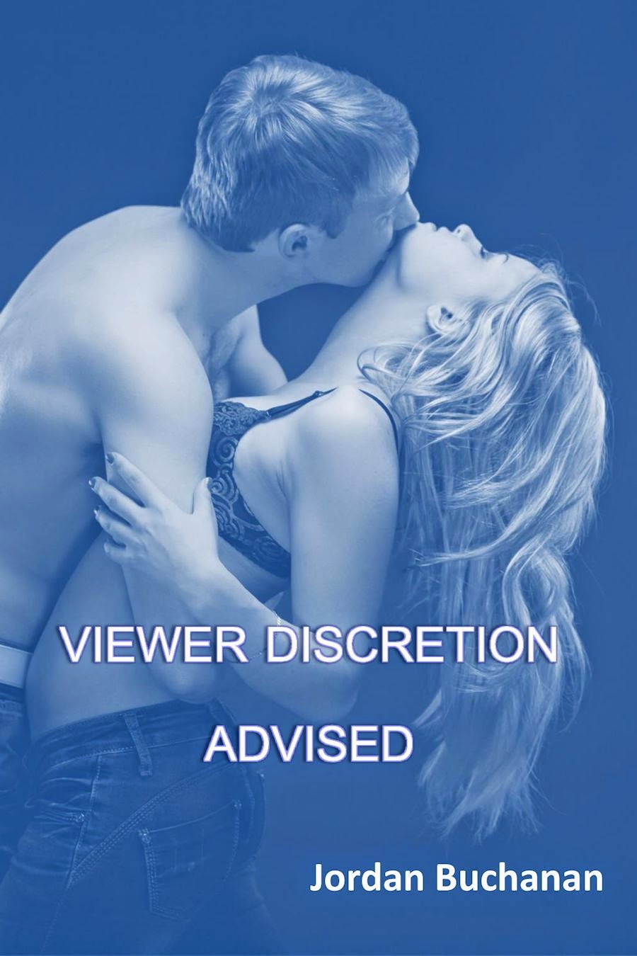
Here is the original cover I made for Viewer Discretion Advised (top) and the one I replaced it with.

Did I notice any difference in sales when I updated the covers? No A Facebook friend and fellow author conducted
a survey in February, asking readers how they choose their reading material. Covers were far down on the list. I don’t choose what to read based on the
cover but I realize that in my case, it’s due to my poor vision. I can’t see the thumbnail covers on my Kindle
very well. If I search “erotica,” the
results all look very similar. I know
that’s not the case for most people, but still, I don’t want my books to look
like everyone else’s, and I want them to be more closely tied to the story than
good looking half-naked people.
The mythological phoenix plays a part in my next story to be published,
Second Chances, and it IS going on the
cover. My other option is an image of a
slutty bride and I’m not going for the obvious this time. My only problem is I can’t decide which
color. If you have an opinion, please,
please comment. I could use the advice.


I do believe the cover art on print copies is more of a factor for
potential buyers. When I still bought
books in a physical bookstore, covers did catch my eye, but it was still my
normal practice to gravitate toward my favorite authors first. If there was nothing new from them, I checked
out what was else was in the genres I
preferred. So until I’m convinced otherwise,
I’ll choose attractive covers that make sense to me. There’s that mulishness again.
NEXT POST: Launch sequence
I think the orange one stands out more. Hope that helps.
ReplyDeleteYes it does, thank you for weighing in.
DeleteMy vote goes for the red/yellow/orange one. The hotter color would seem more appropriate for erotica.
ReplyDeleteThanks,, Maggie!
DeleteJordan, I recently listened to a radio show about effective advertising. It talked about a large consumer study that had been done, that found products with reds in their images significantly outsold similar products whose images had other colors ( ie non-reds). I think we authors should use the information gained in studies like this one, and apply it to our own marketing. Therefore, my vote is with your red/yellow phoenix. Very eye-catching!
ReplyDeleteThank you, Dianne, for the info. Now I can claim a method to my madness. I prefer the yellow/red one myself.
Delete